When it comes to the logo design process, we do our best to come up with a logo that communicates what you offer your clients, as well as making sure it is memorable and will last through the ages. However, there is one aspect of logo design that is often overlooked but plays a huge part in your branding and how it affects your customers: Color.
Color is vital to how we can communicate with our customers on an automatic level. Keep in mind that identity design is about what works, not personal preferences, and as a graphic designer, it’s important for me to explain why your favorite color, pink, might not be the best choice for a law firm.
How We Process Logos
When it comes to understanding design, there is a sequence in which your customers will associate your brand. Shape first, color second, brand name and content last.

Your logo will be given seconds to deliver a lot of information to your customers. You have those few seconds to make sure your brand sticks, and that your customer will remember you. Understanding the scientific impact color choice has on your customers could increase the effectiveness of your company’s branding.
The Psychological Effects of Color in Design
Color choice can trigger specific emotions and create a brand association. Your logo color not only needs to differentiate you from your competition, but it also needs to make sense emotionally. For example, the color red screams fire, determination, and energy. In the human body, the color red boosts appetite, raises blood pressure, and increases respiration rate. You wouldn’t want the color red on a logo for a spa. A better fit would be the color blue, which has proven to be soothing and boost confidence.
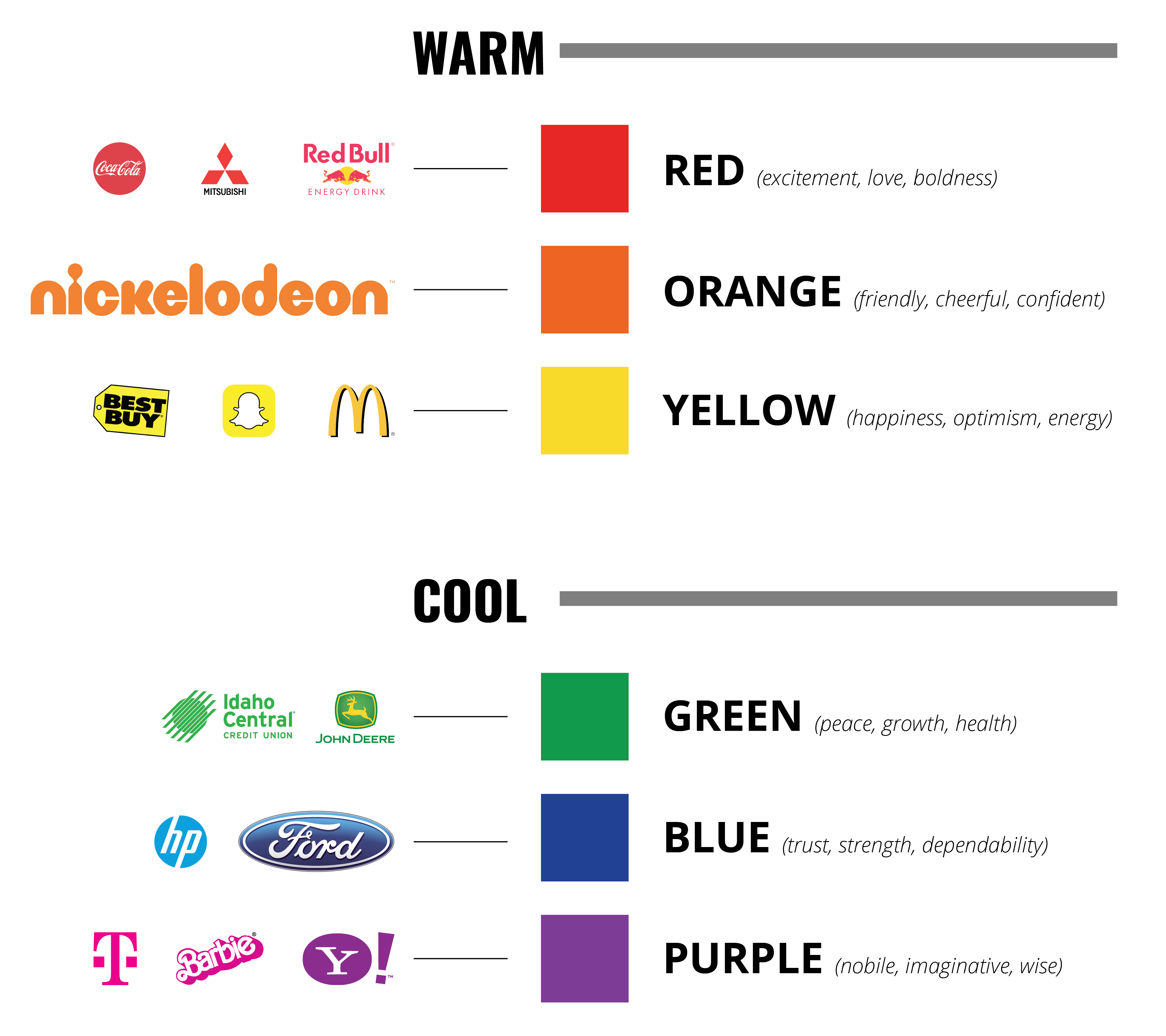
The Use of Color from a Marketing Standpoint
Branding and color are linked because the color offers instantaneous identification of your brand. Using the color consistently with your marketing (i.e. social media posts, style guidelines, website, etc.) helps you “own” your color. Over time and consistent use, your customers will be able to identify your brand simply by the color you use in your photos, graphics, etc. Even though there isn’t any branding or bottle shown in the image, but you can still tell this picture is an advertisement for Coca Cola, simply by the color.

To select the best colors for your brand, make sure you have a clear vision of how you want your brand to be perceived, as well as being mindful that good branding uses consistency and meaning over various forms of media. Don’t be hesitant when you talk to your designer, but remember we know what works and what doesn’t, and our primary focus is to help you succeed in your business